Current Vairumnieks logos and document samples in one place. Choose the appropriate file for digital or print.
All logo versions with separate files for digital use and printing.
Version: 21.09.2026.
The horizontal logo is the basic choice. The vertical version fits into a more compact space, but the separate sign is used where the brand is already recognizable from the context.
Basic version for everyday materials.
Basic version for everyday materials.
The enhanced version is intended for vehicle wrapping and applications where the logo needs to be more visible from a distance. It uses the prepared “thick” file of the logo version without changing its proportions.
For transport and applications where visibility from a distance is important.
For transport and applications where visibility from a distance is important.
The sign is useful for profile pictures, branding, and small accents if the Vairumnieks is recognizable from the context.

For compact placement where the brand is already recognizable.

For compact placement where the brand is already recognizable.
Choose a vertical composition if there is more space in the square. Maintain the original relationship between the name and the sign.
For placement with larger vertical area.
For placement with larger vertical area.
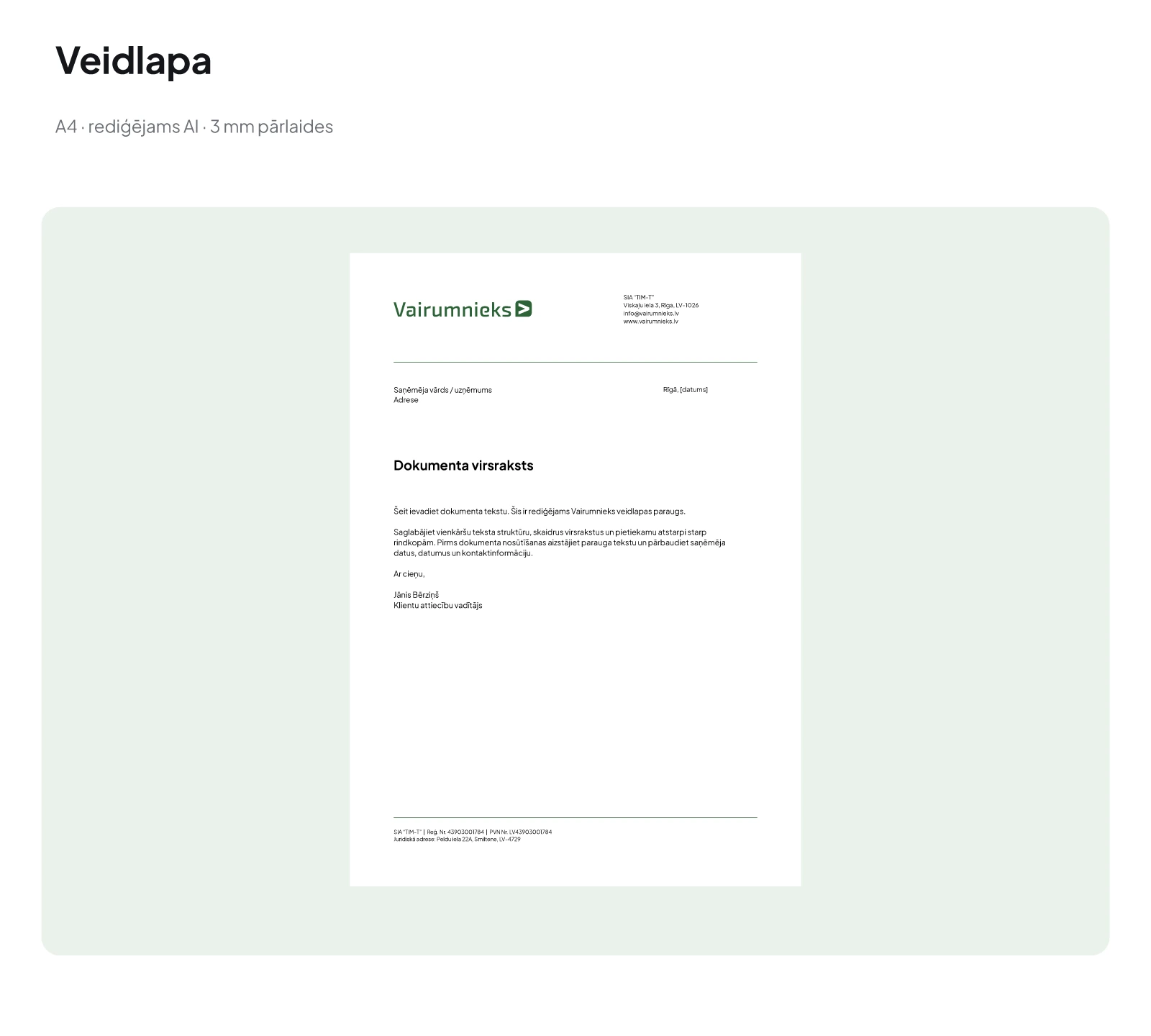
Editable A4 form template with Vairumnieks identity and company contact information.
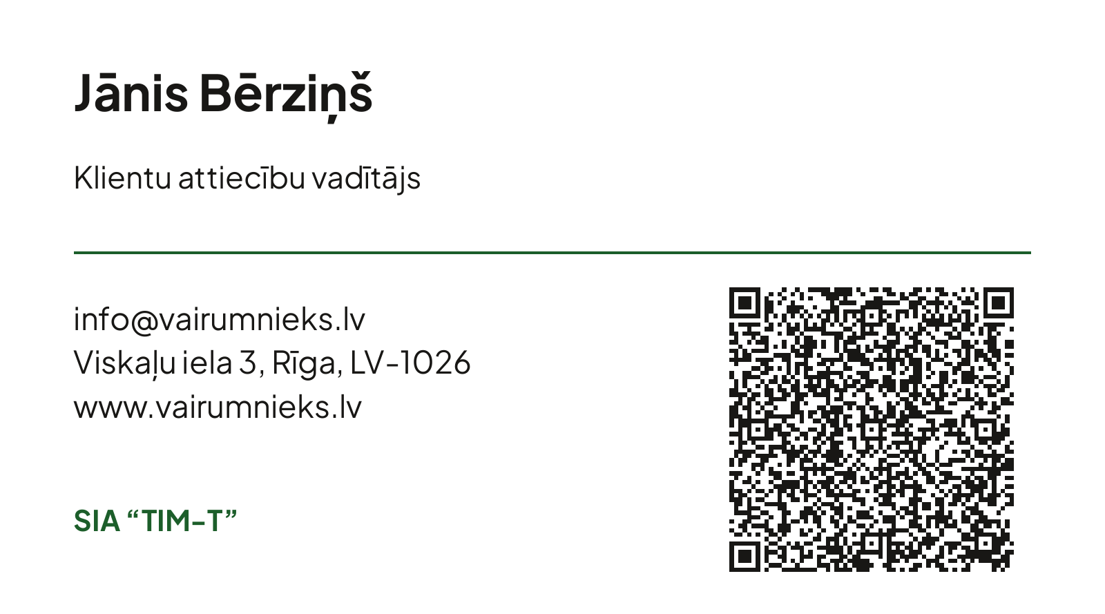
Long, double-sided business card 90 × 50 mm with contact information and a black vCard QR code for saving contacts on your phone. The sample uses a fictitious name and position; if the contact information changes, the QR code must also be updated.
A presentation of the coordinated brand with an identity idea, color palette and examples of use.
↓ Download Brandbook · PDF