The Vairumnieks logo combines the name and the “>” sign. Choose a version suitable for placement and use the ready-made files, maintaining their proportions and colors.
The sign “>” means “greater than.” In the Vairumnieks identity, it is associated with a wider choice and scope. The forward direction of the arrow continues the idea of movement, delivery, and development.
The horizontal logo is the basic choice. The vertical version fits into a more compact space, but the separate sign is used where the brand is already recognizable from the context.
Basic version for everyday materials.
Basic version for everyday materials.
The enhanced version is intended for vehicle wrapping and applications where the logo needs to be more visible from a distance. It uses the prepared “thick” file of the logo version without changing its proportions.
For transport and applications where visibility from a distance is important.
For transport and applications where visibility from a distance is important.
The sign is useful for profile pictures, branding, and small accents if the Vairumnieks is recognizable from the context.
For compact placement where the brand is already recognizable.

For compact placement where the brand is already recognizable.
Choose a vertical composition if there is more space in the square. Maintain the original relationship between the name and the sign.
For placement with larger vertical area.
For placement with larger vertical area.
Leave enough space around the logo. Text, image details, and the edges of the layout should not interfere with the perception of the name and mark.
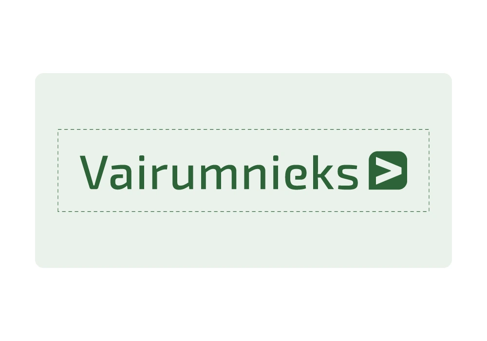
Before using, view the logo at its intended size. All letters and the symbol must remain clearly distinguishable on the selected material.
Base color on a solid white or light background.
Reverse version with clear contrast.
The finished black version for materials with a single-color print.
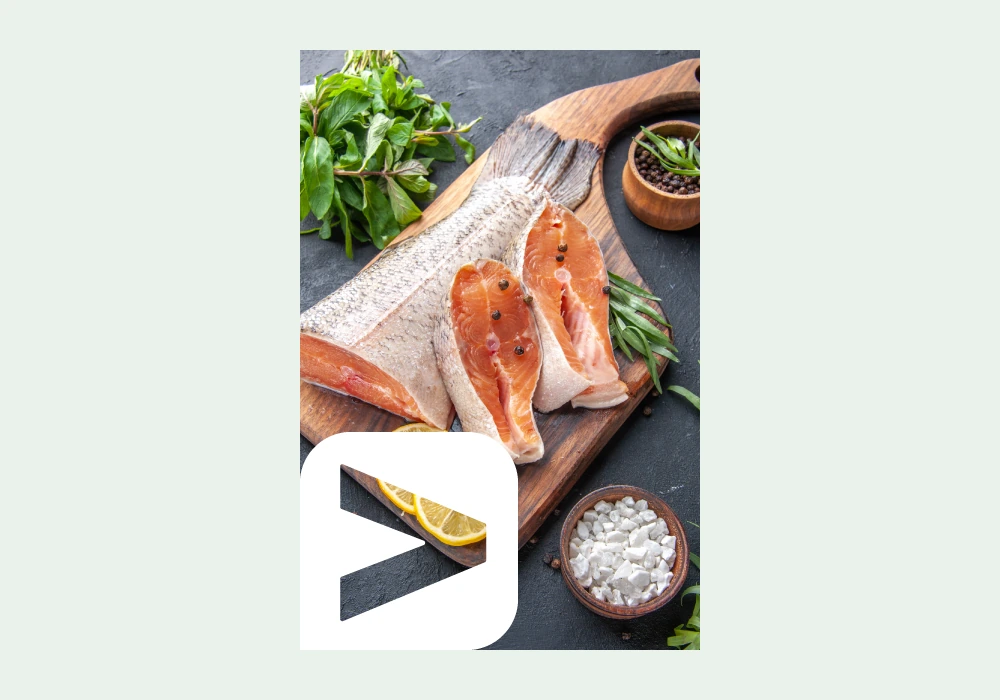
Place the sign in a white area with rounded corners to maintain a clear silhouette.
Use the finished version. The “thick” version of the enhanced logo is a separate approved file – it is not replaced by stretching or an artificial outline of the regular logo.
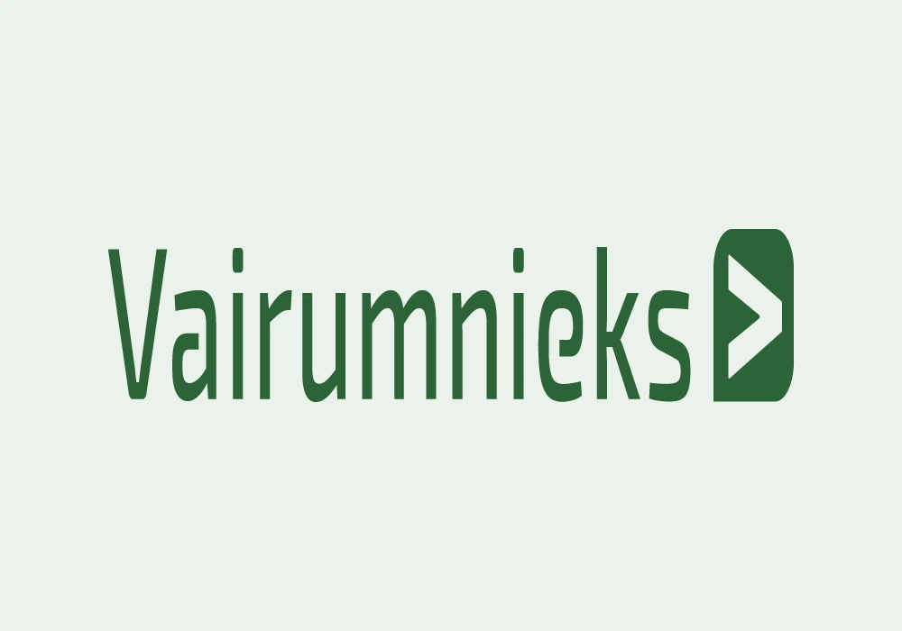
Do not change the logo's width-to-height ratio.
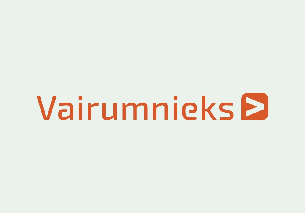
Do not use colors outside of the prepared versions of the logo.
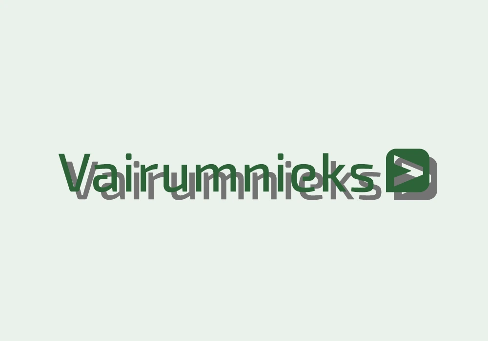
Do not use shadows, outlines, gradients, or spatial effects.
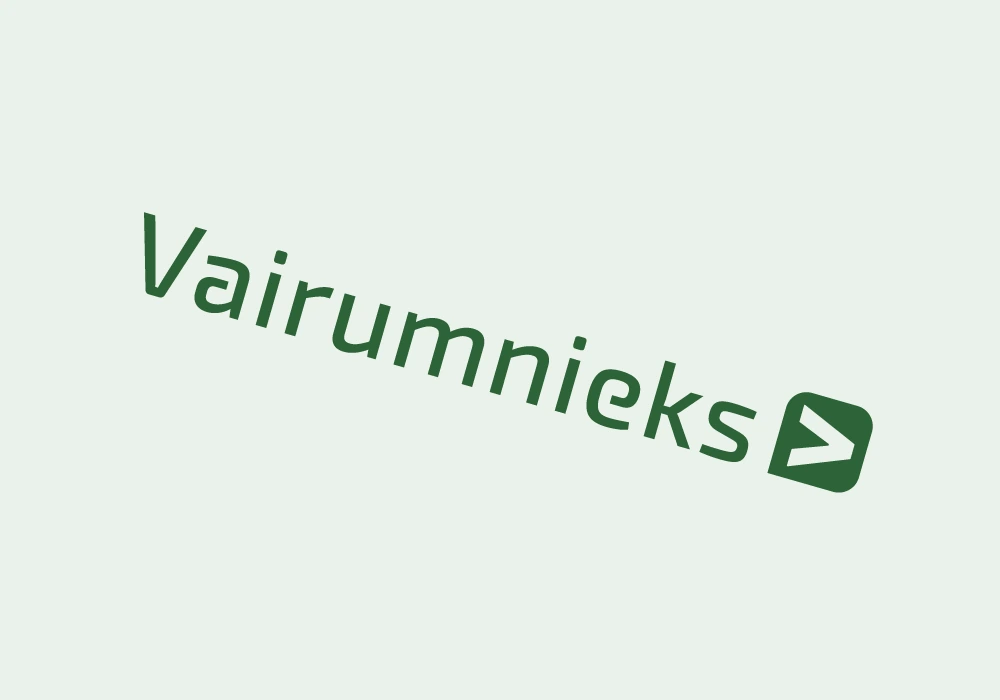
Preserve the original position and direction of the sign.
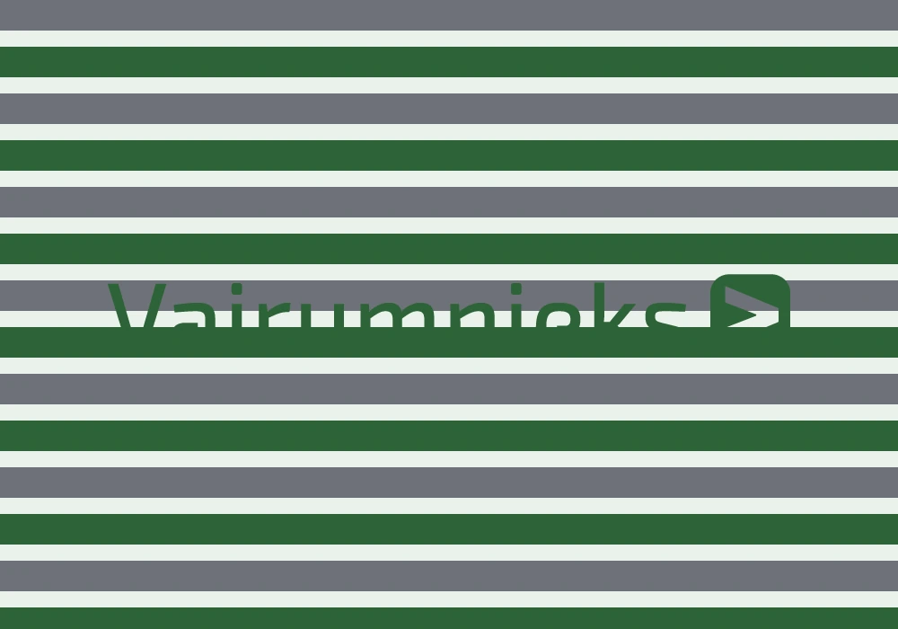
Do not let image details blend into the logo.
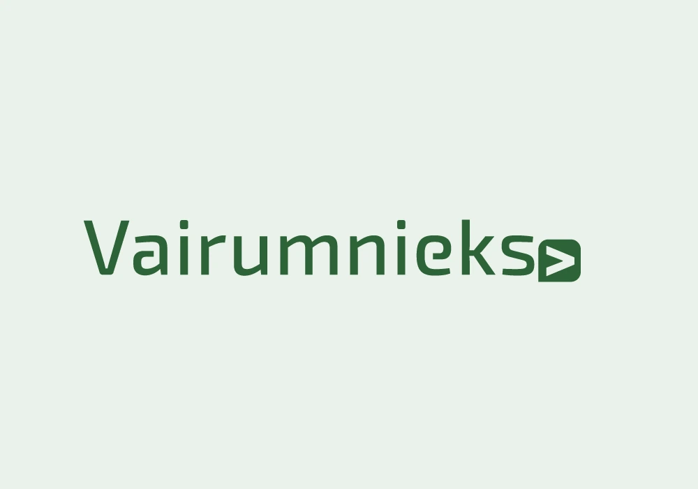
Do not change the distance between the name and the sign and do not replace the letters with a different font.
Vector file for web and digital mockups; maintains sharpness at different sizes.
An image with a transparent background for presentations and everyday documents.
An image with a ready-made background for apps that don't require transparency.
Vector file for placement in layouts. Choose RGB for digital use or CMYK for printing.
Editable Adobe Illustrator source for design and print materials.