
Practical materials for unified Vairumnieks communication. Use ready-made templates and adapt the content to the specific purpose, maintaining brand colors, logo proportions, and a clear hierarchy.
Product photos, clear color bands, and a recognizable brand create a unified material look.
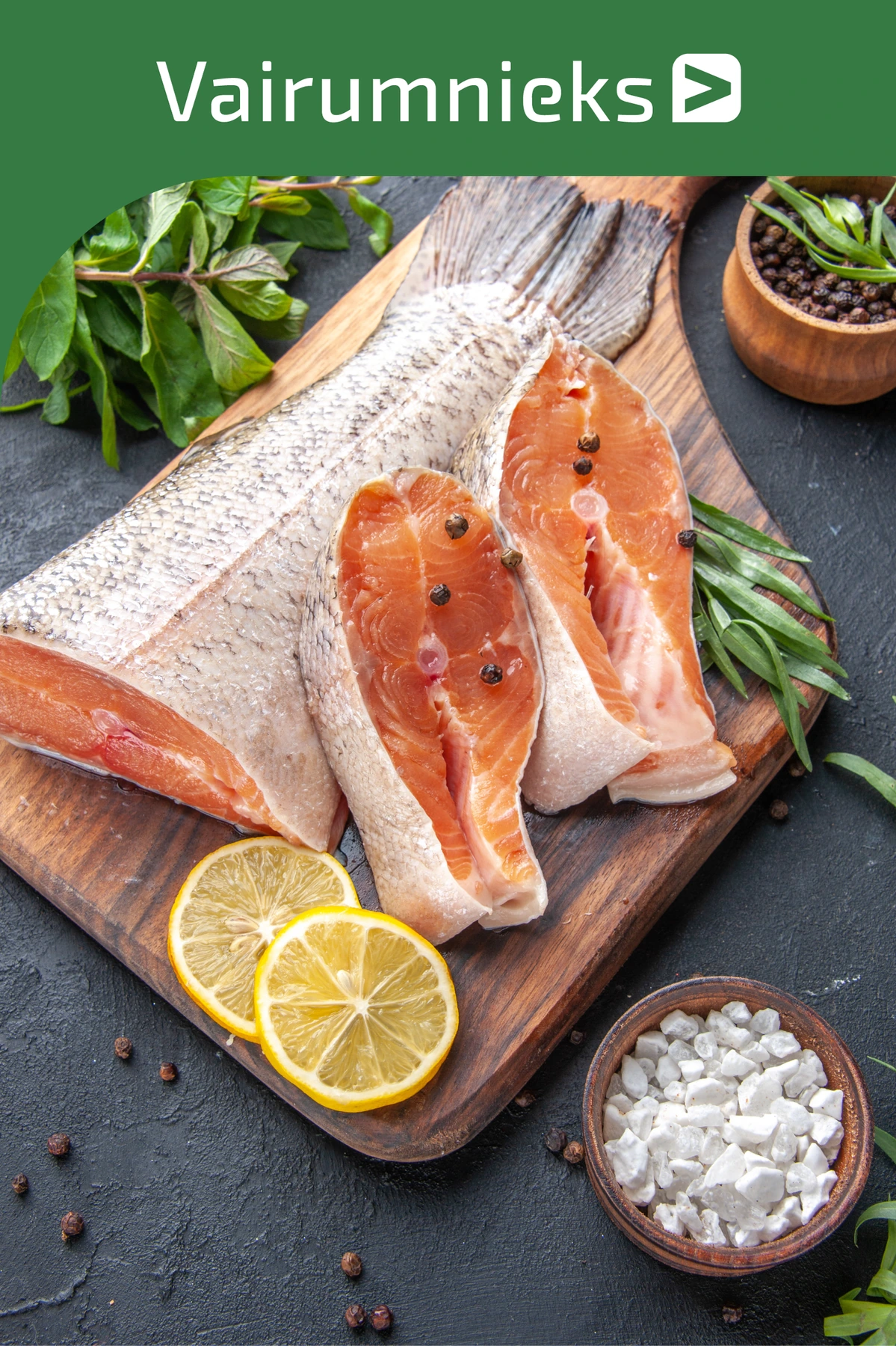
The product photography is the main focus. The green bar gives a clear space for the reverse logo.
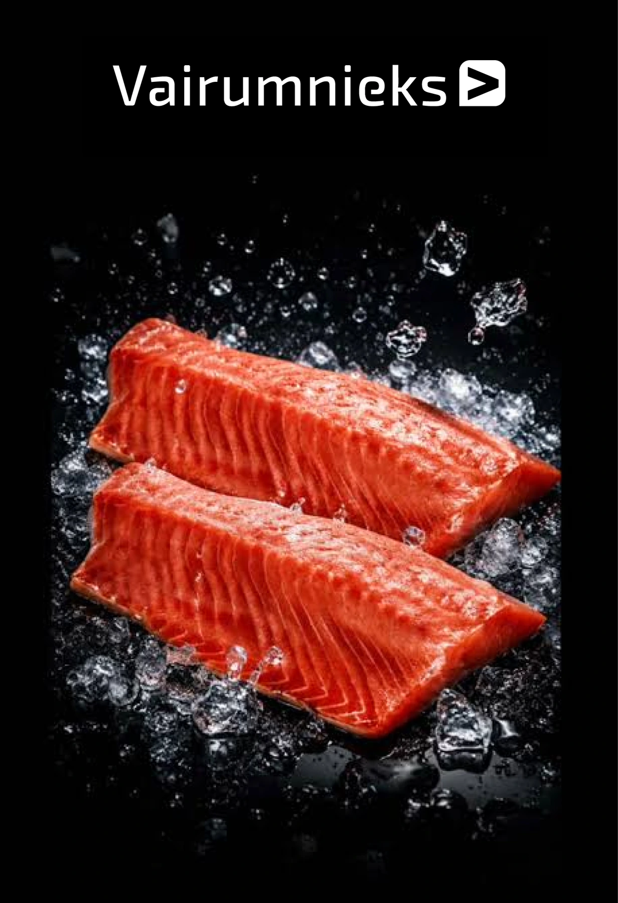
The white version maintains contrast on a dark and uniform area of the image.

A white area with rounded corners separates the sign from the image and helps it be clearly perceived.
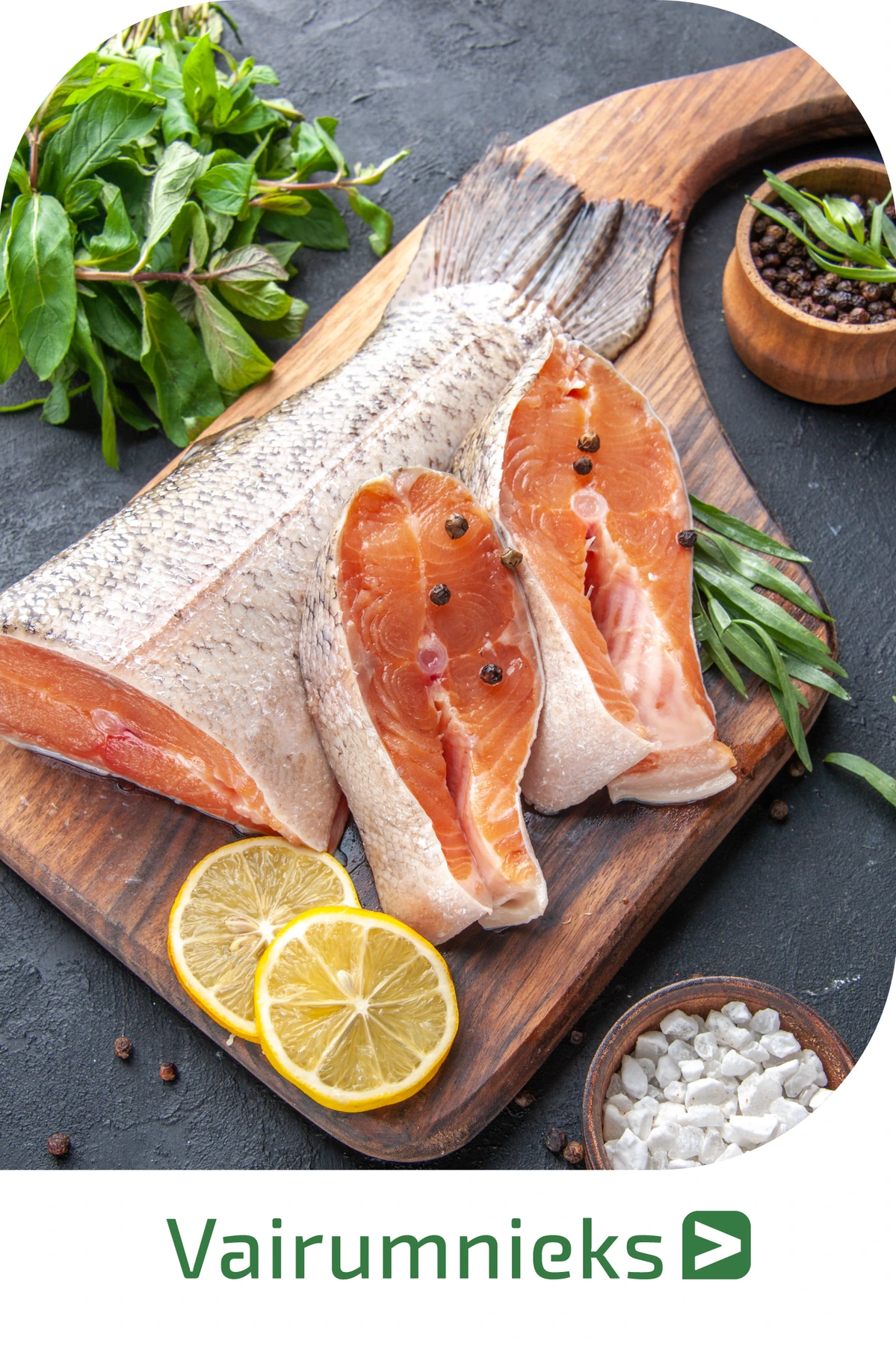
The light bar combines the photo with a clean and clearly legible branding area.
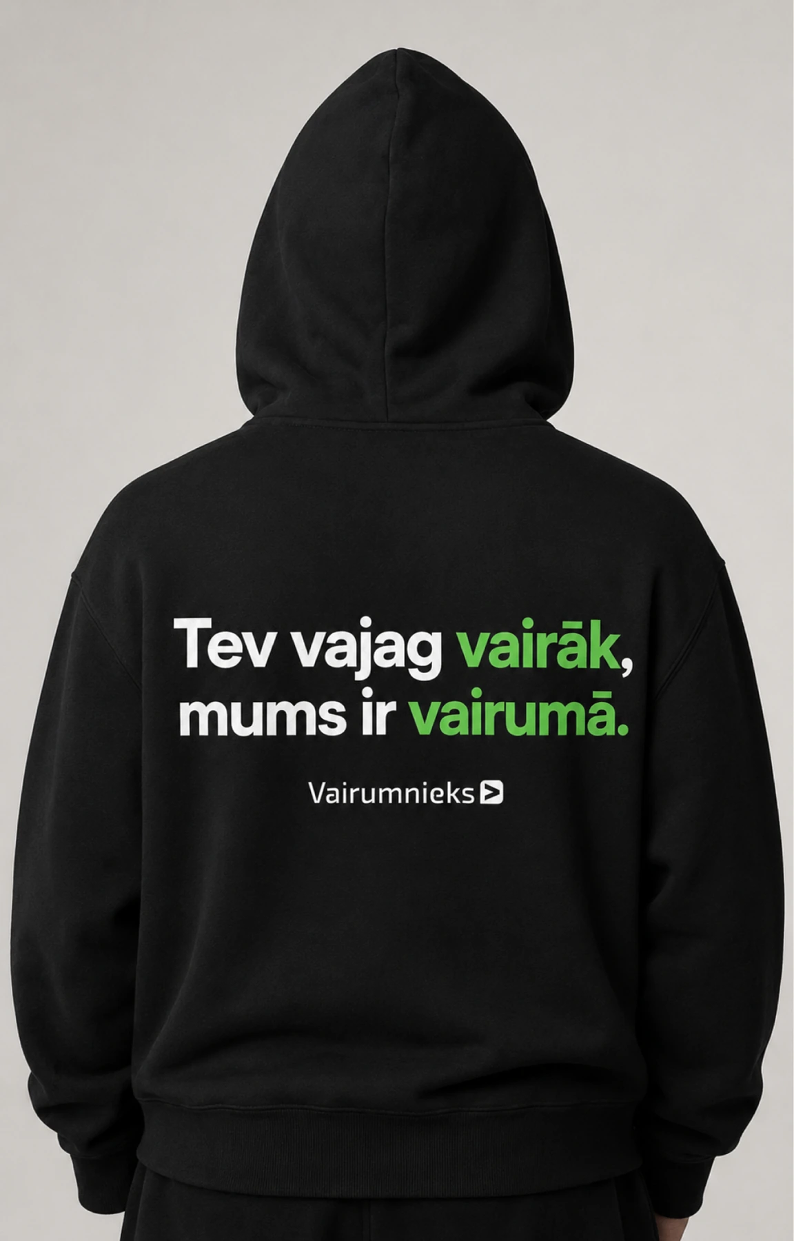
Black sweater with a short message and a small white Vairumnieks logo.
Uniform line icons help distinguish product groups. Maintain the same line character and clear contrast against the background.
 ↓ Download icon set · ZIP
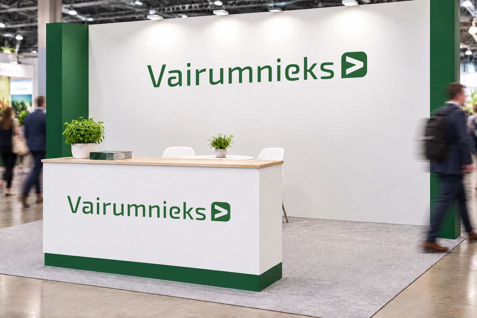
The original logo on the stand and counter creates a unified, recognizable company presence at exhibitions and events.
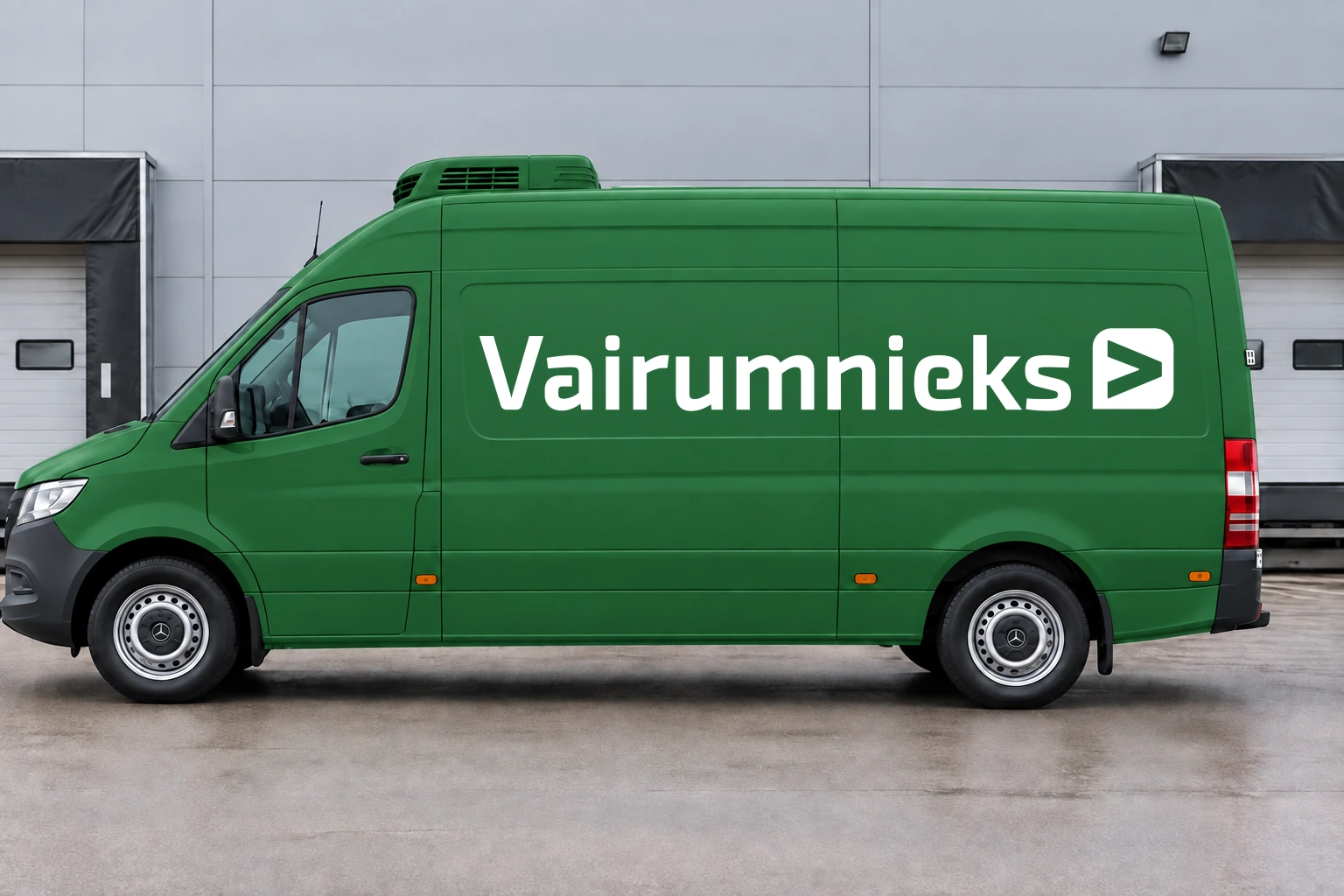
For large surfaces, the reinforced “thick” version of the logo is used. Its visibility from the intended viewing distance is assessed.
• Check names, contact information, links, and dates.
• Select the appropriate RGB or CMYK file.
• View logos and text in actual size on the material.
• Saves the edited source file for future changes.
